Shovl Asset Redesign
These designs were created for the Shovl website, targeting specific issues and advantages:
- Dashboard:
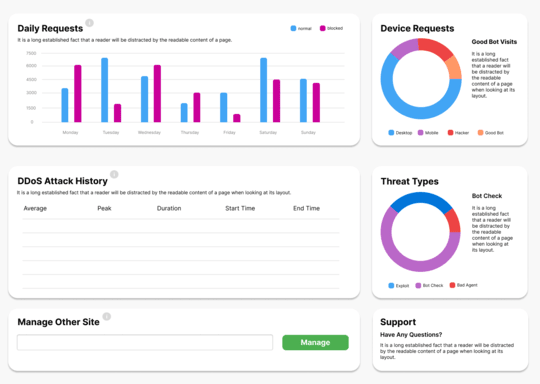
- Data Visualization: The use of bar and pie charts helps to present complex data like daily requests, device requests, and threat types in an intuitive, easily digestible format. The color-coding of normal vs. blocked requests and device categories ensures that users can quickly distinguish between key metrics.
- Clarity and Structure: Information is broken down into distinct sections (Daily Requests, Device Requests, DDoS History, etc.), with clean layouts and sufficient white space, reducing cognitive load and making it easier for users to navigate and focus on specific data points.
- Contact Page:
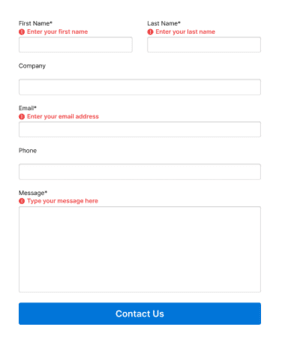
- Form Design: The form follows user input design best practices by clearly marking required fields with red warnings and asterisks. The fields are logically ordered (name, company, email, phone), and a large "Contact Us" button at the bottom draws attention, prompting the user to complete the action.
- Error Prevention: Placeholder text within fields helps users understand what is expected, and error messages clearly indicate when required fields are missing, enhancing usability.
- Pricing Page (Image 3):
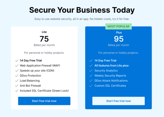
- Comparison Design: This pricing table contrasts two tiers (Lite vs. Plus) side by side, making it easy for users to compare features and choose the option that best suits their needs. The use of color for the "Most Popular" option adds emphasis to guide decision-making.
- Call to Action: Clear "Start free trial now" buttons are positioned directly below each plan, making them easily clickable and highly accessible, which encourages user engagement.
These design elements follow key UX principles such as consistency, feedback, visual hierarchy, and ease of use, providing a user-centered experience that balances functionality with aesthetics.


